22 October 2026

The Sovereignty of Colour and the Aesthetics of Contradiction in Contemporary Abstraction

Amira Naji / Baghdad


Andrew Smith: The Sovereignty of Colour and the Aesthetics of Contradiction in Contemporary Abstraction


There is an exceptional moment in the history of art when colour liberates itself from its dependence on objects and ceases to perform its traditional role of describing the world, becoming instead an independent world with its own laws, music, and expressive energy. At that moment, the painting is no longer a window through which we look at reality; rather, it becomes another reality, born from the encounter between imagination and matter, and between the impulse of emotion and the precision of structure. It is a space in which the artist can reinvent beauty and grant contradictions a rare opportunity to coexist within a single composition.


It is within this horizon that the work of British artist Andrew Smith emerges. He presents a visual world in which colours transcend their familiar boundaries and enter into bold relationships that bring together exuberance and restraint, spontaneity and order, mass and gesture. Smith does not seek to reproduce the external appearance of things. Instead, he reaches towards what places and visual experiences leave behind in memory, transforming their impressions into compositions that celebrate the freedom of colour and its capacity to create new spaces.


The French artist Henri Matisse once wrote: “I dream of an art of balance, purity and serenity.”(1)


This statement opens an important path towards understanding the nature of harmony in modern art. Balance does not necessarily require symmetry, nor does serenity necessarily imply an absence of movement. Harmony may emerge from the confrontation of contradictory elements, provided that the artist gives them visual relationships capable of achieving an inner unity. From this perspective, Andrew Smith’s works can be read as seemingly driven by intense momentum, yet revealing, upon closer observation, a clear sensitivity in the distribution of colour, the organisation of space, and the direction of the eye through the painting.


The fundamental difference between Matisse’s visual serenity and Smith’s expressive exuberance gives this comparison its significance. Harmony consequently becomes an open concept, capable of being achieved through diverse formal means without compromising the aesthetic unity of the work.


Smith’s practice cannot be confined within narrow academic classifications, although his work clearly belongs to contemporary abstraction and intersects with Abstract Expressionism in its freedom of movement, the force of gesture, and its direct response to colour. At the same time, his compositions retain geometric qualities that reveal the artist’s awareness of the importance of structural relationships. Freedom therefore does not become absolute chaos, nor does order become a constraint that limits the spontaneity of expression.


Perhaps what most immediately arrests the viewer in this practice is its chromatic audacity. This does not arise merely from the use of saturated colours, but from the manner in which the artist brings together hues that, at first glance, seem difficult to reconcile. Glowing orange confronts cool blue; vivid green enters pink spaces; violet intertwines with red, while black lines intervene to redistribute visual weight and establish contrasting rhythms within the composition.


These relationships reveal an understanding of colour as a relative value. Its strength changes according to the colours surrounding it, the area it occupies, its degree of saturation, and its position within the painting. A small area of yellow may become more powerful than a large expanse of blue if it possesses the ability to attract the eye and reorganise the surrounding elements.


Here, audacity becomes formal knowledge, and contradiction becomes a means of constructing harmony, far removed from traditional colour solutions based on proximity and direct tonal concord. The strength of this practice is also evident in the artist’s technique, particularly in his handling of acrylic paint, which allows for rapid execution, multiple layers, and surfaces that shift between density and transparency. The pictorial surface is not merely a place upon which colour is applied; it becomes an arena in which brushstrokes intersect and marks, lines, and masses coexist, creating a visual fabric rich in detail.


Smith exploits the material properties of colour to produce varied rhythms. Broad brushstrokes appear alongside winding lines and small marks, while geometric forms intersect with freer configurations. These treatments give the painting a sense of continuous movement: some areas appear to advance towards the viewer, while others recede into the depths of the composition.


The black line, meanwhile, performs a function that extends beyond defining shapes or separating areas. It becomes an independent expressive element, possessing its own weight, direction, and movement. It slips between colours, cuts through certain masses, and meets other lines, creating a network of visual relationships that prevents the eye from settling upon a single point. In this way, line becomes a partner to colour in constructing the image rather than merely an external frame defining its contours.


In Ameln, completed in 2023, one of the most distinctive characteristics of Smith’s visual language becomes apparent. Orange and yellow areas stand alongside blue and green, while dark marks are distributed across the composition, giving it a pronounced visual tension.


Ameln 2023 100 x 100cm acrylic on canvas

The forms do not appear to be governed by traditional perspective. Instead, they move according to an internal logic based on overlapping, intersection, and the distribution of chromatic weight.


The structure differs in Valletta, also completed in the same year. Here, colour masses gather around a central dark area, while the surrounding forms are distributed through relationships that combine movement with stability. The painting derives its strength from the contrast between large expanses and linear details, and between warm and cool colours, transforming it into a visual experience that distils a sense of place without relinquishing its emotional resonance.

Valletta 2023 100 x 100cm acrylic on canvas. Private collection

These two paintings are connected to the artist’s experience of the places he has visited, particularly Morocco and Malta. During his artistic residency in Morocco, he drew inspiration from the intensity of desert light, while the natural landscapes surrounding the Atlas Mountains offered different chromatic possibilities. The city of Valletta, meanwhile, became part of a series of works in which he evoked his geographical and visual experiences.


This relationship reveals a different conception of depicting place. The artist does not reproduce its architectural or natural details; instead, he reconstructs the impressions left by light and colour in his memory. Geography thus becomes material for abstraction, and place becomes a sensory experience that can be rebuilt beyond the conditions of direct representation.


In the works associated with his participation in the International Painting Symposium at the Mark Rothko Centre in Latvia in 2021, a denser treatment of geometric composition becomes apparent. The surface is divided into areas in which colours, marks, and linear rhythms overlap. These works reveal his interest in the relationships between parts and his ability to employ geometric division without sacrificing the freedom of expressive movement.


Mihaila, Aleksandra, Konstantina , Hekela  2021 each 120 x 120 cm acrylic on canvas. Mark Rothko Centre Permanent Collection


Hibiscus Party, completed in 2024, presents a different world in which the density of detail intensifies and coloured marks and dark lines intersect within an intensely vibrant, celebratory space. Pink, green, and blue areas appear to compete for the foreground, while black forms lend the composition visual weight, interrupting the continuous surge of colour.

Wuhou ( Hibiscus Party )  武侯( 芙蓉盛放) 2024 150 x 150cm acrylic on canvas. NY20+ Collection Chengdu China

These works raise an important question concerning the role of chance in the creative process. Some marks appear to have emerged from spontaneous movement, yet they settle within a formal system that gives them meaning and establishes their relationship with the other elements. From this emerges a dialectic between freedom and control—one that gives the practice its vitality and allows the artist to continue exploring without falling into repetition.

Perhaps the most significant aesthetic value in Andrew Smith’s practice lies in his ability to redefine harmony. He does not seek beauty in closely related colours, nor does he avoid sharp confrontations. Instead, he gives differences the opportunity to establish a new visual unity. Expressive power does not arise from colour alone, but from the relationships the artist creates between colours and from his ability to transform contradiction into creative energy.

Smith’s work presents us with a practice that confirms that abstraction is not a departure from the world, but another way of discovering it; that colour can retain the memory of a place without depicting its features. It is a practice in which the brush becomes an instrument for reorganising sensation, while the surface becomes an open space for experimentation and adventure.


In Andrew Smith’s world, colours do not need to agree in order to create beauty. They need only possess the capacity for dialogue, and each colour must find its place within that tense yet balanced composition. From their differences emerges a visual music unlike any other.


(1) Matisse, Henri. Notes d'un Peintre. 1908. La Grand Revue, Paris (Volume 50, issue 24)


About Amira Naji.

Born in Baghdad in 1974. Visual artist and art critic.

Amira Nahi holds a Bachelor’s degree in Fine Arts from the College of Fine Arts, University of Baghdad, Department of Visual Arts, specialising in Painting and works as an art education teacher with the Iraqi Ministry of Education. Nahi's practice encompasses painting and art criticism, and in this role contributes articles on art and culture to the Iraqi and Arab press. Nahi is a member of the Iraqi Artists Syndicate and the Iraqi Plastic Artists Society.

19 August 2026

Studio Painting 2025: Rhythm and Duality

Studio painting for this year acted as a consolidation of the work that followed the China residencies 2023/4. In 2025, there were several objectives. Firstly to create a series of small to mid sized paintings, as all those of 2024 were large scale on canvas and paper, planned for the exhibition at the large spaces at Oriel Môn. With two exhibitions at the Appleby Gallery in November and the Turner House in April 2026, smaller and mid sized paintings would be required. Another objective was a further exploration of the hands free application of paint and increased liquidity and fluidity of paint in relation to current work. Fluid and poured application has been used in recent work but not as a primary focus of composition. 

The year began with a drawing series. I find it is always a good way to commence the year as a series of exploratory work; it is method used on location in residency situations and rather than acting as a plan or design for later work, it is more a setting of the mind, at the same time clearing the decks, familiarising the studio environment after the winter break and setting a working method focused on production, process and making rather than any contemplative preliminary thinking - the process of doing sets the pace. 


As part of a recent series these monochrome works consider a spatial configuraion of marks and fluid applicaion of paints and mediums. I consider these primarily as drawings because they are concerned with line and positioned separately to the colour work, but as made with paint, they must be identified as paintngs. I think this is one duality of the series with the other being the spontaneous application and calligraphic like gesture that through the method of applicaYon appear mixed; perhaps a duality of purpose.

The kind of gesture I am concerned with is fluid, spontaneous and fleeting. The movement instinctive and unconscious; whilst making one’s thinking is deliberately abstracted so that intention is absent and response unguided in a cerebral way. The state is somewhere else. Getting to this point or place takes time and concentration, not just within a day but over the duration of making, a week or two.


  1. Painting started in early April with preparation of three large vertical paper supports, one paper support designed for two smaller paper based paintings (rather than using the full sheet of paper), two larger canvases and several canvases at under one metre square with a number of very small canvases. This was a conscious decision to make smaller works as outlined above. One of the larger works was a reworking over an existing started but not finished, oil painting. I applied one gesso to this painting and some painting was carried out during this session but the result was heavy looking and I rejected the canvas. My focus during this year was on the small to mid range works.


  1. Pechina and Tuyen Lam in progress

    Zapillo and Naiyang in progress

    The main process development for this year was the paint application by pouring. This seemed a priority to apply colour without hand, brush and gestural movement. Colour applied directly onto the surface to emphasise the distance between paint and surface.In terms of application the paint operates seemingly on its own terms. Colour can flow and mix on the canvas surface and once applied, moved and mixed by tilting and revolving the support )in this case, the boards on which paper is stretched). I also applied this process to the two smaller works on paper, considering the reduction of area and adjusting the application accordingly. this meant reducing the height of pour and quantity of paint. 

    Detail of Mekong in progress

    Bach Dang in progress


    Detail of Dong Khoi in progress


  1. In addition to this pouring element I developed the hand applied painting to identify an application begun in 2024. Calling the pictorial elements 'rhythms' where a column or row of blocked colour applied by flat brush would traverse a section of the painting. They are calligraphic in form but not of the grand gesture type as so evident in the work of 2024. Instead, these are quiet and more 'sub plot' yet have a feel of being frieze like and calligraphic perhaps referencing an architectural feature, like text on a parapet or a column on a pillar around a doorway. They act as unifiers in a pictorial way. As always colour is the main driving force (as in all my painting) and their consistency bridges areas of different pace across the painting. They feature across all canvases, very small to very large. As always seems to be the case, the larger paintings lead the way in the development of these rhythms and how they work with and around, even against other pictorial elements.


These rhythms therefore, are also a feature of the new small canvases. The first small paintings since the Morocco series of 2023, small works here were developed with a greater range of the colour paint handling and represent the first paintings made since China back in the studio, on this scale. Working on the floor (that seems to be signature way of working, rarely using the easel, the giant vertical board on the east side of the studio) colour flowed across these and I am aware that the rhythm and flowing linear elements work in contrast and this is something to be developed into 2026. 


Penang No.1 23 x 30 cm 

Penang No.4 23 x 30 cm

Worked progressed steadily and working on the small to mid sized paintings presented issues of making that I worked hard to resolve. At times I felt they were too conscious in the method and at these moments one has to back off and re-engage with the painting. For me as soon as consciousness enters the arena the process has been compromised. However four of the paintings were well resolved and I relished working on this size of canvas again. Always setting myself challenges in the studio, the scale of the painting in terms of pictorial element, area, colour and composition feeds into ones overall methodology. 
Pechina 79 x 59 cm acrylic on canvas


Zapillo 73 x 59 cm and Tuyen Lam 86 x 64 cm

Naiyang 82 x 43 cm acrylic on canvas (right)

In November I held a solo exhibition at the Appleby Gallery, Romford, East London. The exhibition featured the new work made this year and included some previous 2023 and 2024 paintings. I really liked exhibiting in this gallery as the work seemed to allocate well to the room dimension. Well lit with both natural and good electric light, colour reverberated around the spaces of the single wooden floored, high ceilinged, gallery. 

Colourscapes at Appleby Gallery November 2025. Dong Khoi (left) Bach Dang and Mekong. Each 212 x 114 cm acrylic on paper 2025


One international symposium was undertaken. 'The World Paints Kerkannah' took place on the island of Kerkannah, Tunisia. This was an intensive and quite short large group symposium comprising artists from Tunisia and international artists. Located close to the Borj el Hsar Fortress site, the historic location provided a rich and atmospheric setting, a Phoenician port, the sea with seemingly constant strong current.

Presentation evening with main organisers: Artist and Curator Fleur de Lys (centre); Guerbba Maher (right) and Guerbba Emma.

برج الحصار Borj el Hsar. Acrylic on canvas 150 x 120 cm. Kerkannah Art Symposium Organising Committee. 


The YouTube published studio review completes this blog post, tracking studio activity for 2025. 

Dong Khoi (left) Bach Dang and Mekong. Each 212 x 114 cm acrylic on paper 2025. Left Ameln 2023 100 x 100 cm acrylic on canvas. 

16 April 2025

Painting ' After China ' Studio 2024

Studio work 2024 saw the production of three new large paintings on canvas and a series of works on paper, the largest paper works ever undertaken. This new work followed a time of reflection after returning in January from two Artist in Residence placements in China. The new work was made starting late March (my usual time for commencing work from St David's day 1st March when the light in the studio is good) with an aim to finish by end June for exhibition in the magnificent space at Oriel Môn on Anglesey, commencing late September. 
Oriel Môn is a large gallery space with walls up to 17 metres in length and over 3 metres high. My co- exhibitor John Hedley and myself had discussed exhibition configuration and with John's use of 3D space in the central areas plus installation with mirrors and plinths, it seemed to fit with my work running on the right side on entrance that has one continuous long run of wall space. Therefore large works to capitalise on the copious gallery dimension were planned. I wanted high paintings, vertical in format, new to my previous work almost exclusively landscape format. The new work ' After China ' was to be different with as a start point, the vertical format that references the Landscape and Calligraphic painting of China; a challenge and different way forward, both in the three planned canvas works and paper series. 
Stretchers for the new paintings were made from recycled paintings from the shape canvas era (pre 2016) and actually three paintings that had never been completed were decided to be reconfigured. Dismantling them and making into rectangular formats was the first stage; the build outs removed and straight struts used to make new stretchers. Having decided on large format, two were very large (more than two metres in height). The paper boards were stretched with Fabriano 150g drawing paper (on a roll) using the full size of the board; this size of paper the largest yet undertaken. 

Talking about new large vertical works on paper considering what is the difference between these and the new large paintings

Reworking stretchers from previous work that had build outs to create rectangular stretchers
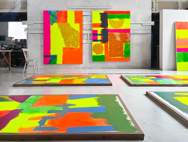
Painting began on the canvas in response to the format of the painting; areas of fluorescent paint and medium (Golden) were applied to configure the space on each. The start time focuses the mind and develops thinking around making the painting. Here the process of applying blocks or areas of fluorescent colour (orange, yellow, green and pink), is perhaps formulaic and a gateway to kick start the engagement with the painting, its dimension, area and scale. The process starts by this method and from this point on the arena of the practice of painting is defined. What did I want with these new works? Following on from the 'final act' painting at Chengdu, the calligraphic like gestural element was to feature in all these works. I wanted to push this aspect of the language of painting and in a grand way. I wanted to encapsulate cultural and environmental aspects of China through visual forms encountered. Screens, for example (with right angled structure) that cross wall and openings; aspect of Landscape painting encountered at Guang Hui Art Museum and Chengdu Biennale and the highways, street and boulevards of the sky scraping cities encountered.  Why grand? I wanted a statement in line with reflecting the size of China; its hugeness, not just physical of course but cultural, in every sense, both ancient and modern. 
Early stages of Zunqiaoxing (left) and Tianfu Jincheng 
New work in progress. On the floor Shanghai series on paper and cropped right, Chongquin, started later on in the series 
The Calligraphic aspect of Chinese Painting as discussed in previous two posts forms a central interest in my application of paint since 2020 and had now reached a point that a calligraphic like gestural element would be a central concern in the three new paintings and an important element of the paper based works. It seemed right conceptually that this form would be the main compositional element in the works and therefore with this in mind and clear that these elements of the paintings would be made toward the end of the painting, the orchestration and progress of the painting had this end goal in sight. This meant that as the painting progressed one was thinking that here or there would be a large scale sweeping form and that space or area was worked to support this goal. As with all my painting there is no direct planning with drawings or sketches but one is thinking ahead: this could work or that might be good. 

ZUNQIAOXING
The following images are of Zunqiaoxing in stages of development. below, for example features the large yellow disc that would in the final calligraphic stage hold the large brush 'statement'. 
The grid forms appearing on all three large paintings are reminiscent of my memory of the interior artichectural features across walls, windows and screens. These are applied using masking tape fior straight edge. Pictorially they command the dimension of the painting by engaging the edges of the canvas and implying continuation whilst also setting a horizontal contrast. 
Echoing the main opposite direction form of the top part of the painting these two dual angle blocks in deep red maroon imply a grid but are not complete. Sitting on top of the fluid down pouring element, they emphasis the vertical aspect of the painting.
The main opposite direction form (two right angles) at the top part of the painting in progress
Reworked multiple times with varnish this higher disc form has a floating gestural paint form in a green gloss medium layer that has a spontaneous and uncontrolled application that at once defines the area and perimeter.  
In taking about this part of the painting I wanted to express what the brushwork means and how it aligns with the ethos and intention of the work.
This was the first of the three large painting to have the large calligraphic like gestural element applied toward the concluding stages. In order to work directly above the painting, an improvised ladder platform was used. This was later developed with a fitted platform to rest in the centre (see later images) and is now a studio equipment for future works that require central positioning to floor based painting; so directly above the area to be painted. If from the side, a stretch or side positioning could lead to an unsatisfactory or even awkward gesture. This facility allowed full arm, hand, brush sweep, subject to paint load and viscosity of course. 

Talking about the later stages of the making of Zunqiaouxing. With this part of the painting stage, reflective comment on the timing, approach and practicality of getting above the floor based work.


TIANFU JINCHENG
Tianfu Jincheng was the first of the large paintings to be worked on after initial fluorescent stages and the second to be resolved with final calligraphic like gestural element. The intensity of colour in this painting seemed to be the most developed in terms of luminosity and vibrancy. In this new series of work I wanted to further develop my use of acrylic paints and mediums. Using several Liquitex, Golden and other mediums a full range of colour application was possible. Really one is no longer talking about acrylic paint as the mediums are the most significant carriers for the colour. In most cases, small amounts of paint are used, it is like a pigment for the mediums. I am using Golden, Schminke Academy, Jo Sonjas and Liquitex paint. Following from China where my main improvised medium was a Pebeo varnish (made under licence in China) I bought a Pebeo varnish here but it did not have the same consistency of handling or function as the China version. Varnishes are used throughout my process to add a break in the layers of paint, provide support for further applications and revitalise the areas of colour. I am primarily using gloss or semi gloss varnish and medium. Jo Sonja paints I have found are very good paints made by Australian Chroma. I have always liked the range of colour, slightly unusual names and hue, but they are matte paints, so I have to work hard on them to create lustre and finish. 
Created with a negative space this sun like disc seemed to work with a sliding horizon; the right orange bar one of the original fluorescent columns of colour, reworked with later additions of orange. 
These square format forms are reminiscent of the signature sections on paper based work in China. I find they are useful small focus compositions within the composition and have experimented with different internal paint applications for them; internal as there is border around the edge. The change of scale and focus creates a picture within a picture. They are all spontaneous paint work. The section below is from Zunqiaoxing including a cropped calligraphic like gestural element and below, a square within a rectangle, gold on orange. 
Early stage of the section that would hold the gestural element on Tianfu Jincheng. The images below document its application. 
Section for the gestural element is masked and with the ladder platform, placed to face toward the top of the painting. 
Initial application was a green grey. Quantity sufficient for large brush and full arm width gesture plus correct viscosity was required. An ivory white was then applied whilst the green grey was still wet to enable mixing and in brush stroke linear effect from the sweep of the brush. This fusion creates form in the brush mark. Below is the final removing of props. The painting of this element was completed in an afternoon and once done was there indelibly; irreconcilable if not right. I remember leaving the studio concerned that this had not worked; it was too much and did not fit. Upon returning next day, I realised with some elation that I was wrong and the element was great! I had got to a stage of thinking that this could be done. Spontaneous unconscious concentration! 
The third painting in the series Chongquin follows this video. As a reflective comment on this new work, just prior to exhibition, the film is a contextual statement.  

Main reflective studio comment on this series of work. The film references the dichotomic calligraphic and gestural painting genres of East and West cultures.


CHONGQUIN
Chongquin was the third in the series and the smallest at just 144 x 136 cm. Following from the other paintings this had the process behind it and a consolidation effect is bound to be in place. It has a fluidity evident, a fluidity of continuity of thinking and progress through the process of painting; something like confidence but more to do with a knowledge and understanding of the current engagement with painting. When working ensues day after day, week after week, the mindset and concentration are developed and at this plateau of thinking, dimensions and possibilities are heightened; a contrast to the start time. 
This auqa turquoise was placed over the red and burnt siennas that had been applied, scrapped wet and re applied. As described earlier a coat of varnish created a base for the aqua to sit on creating space. 
Chongquin contains three sections of calligraphic like gestural element and this seemed to fit with the composition in a vertical emphasis. The intense deep dark colours are, in my mind, astounding and a testament to the possibilities of the excellent pigments and mediums available. Again as in the image below, working back into the paint mark with another colour creates a standout form yet equally valid are the single colour forms that command their own structure through the operation of the surrounding and apparently underneath colour. 
On the Calligraphic Like Gestural Element
The term gesture in terms of western painting implies an approach of free expression and accident. This is contrary to the method here and defining the calligraphic like gestural element of my painting methodology needs to be explored. It is a form of gestural painting in which the visible sweep and manner of applying pigment has been deliberately emphasised, to carry the maximum expressive idiom and at the same time recognising the importance of unplanned and spontaneous action, yet not one that attaches importance to splashes or spots of colour that had no intention behind them. As discussed in previous contextual posts, my painting resonates with one characteristic above many others in the Calligraphic painting of China, one of the power behind the mark being of highest importance, a method with meaning and control. Whilst no direct meaning in signs and symbols are present in my work and they remain unreadable, the resonation is with control and intention. I think perhaps, it has something to do with reality; an expression of an abstract half conscious world, that eludes both reason and direct observation. 
The three ' After China ' paintings are featured here with the paper series before preparation and departure for exhibition at Oriel Môn.

Short video walking around the new work from 2024 ' After China ' with paper work still on stretched boards prior to preparation for exhibition at Oriel Môn.


Critical contextual thinking in developing this work can be found in the previous post but one: 

Cysylltiad Lliw + Colour Connections
Oriel Môn September to November 2024 
Installation of the three paintings on canvas and four paper based work representing the complete portfolio for 2024
Cysylltiad Lliw + Colour Connections was a joint exhibition with John Hedley
The Shanghai Series: (left to right) Jing'an, Huangpu, Pudong, Yangling 212 x 114 cm
2024 
Acrylic paint and mediums on paper

Zunqiaoxing 223 x 168 cm (left) and Chongquin 144 x 136 cm
2024 
Acrylic paint and mediums on canvas
 Chongquin 144 x 136 cm  (left) and Tianfu Jincheng 235 x 171 cm 
2024 
Acrylic paint and mediums on canvas


I would like to acknowledge the support of Wales Arts International and Arts Council of Wales for the support received in developing this series of work.