
16 December 2012
ØRESTAD STREET ART COMPETITION
The Ørestad street art competition invites artists from all over the world, to submit their vision for transforming a 271 meter long wall in Copenhagen, Denmark, into a spectacular work of art.
Application concept: Title: Acceleration of Colour
From distance viewing Ørestad is a fast moving and horizontal city, with new urban architecture and modern city planning.
The wall is an integral part of the visible experience of the transport system, both road, rail, and pedestrian. The length of the wall and the distance from ‘start to finish’ presents an dynamic for pictorial design that will operate in ‘snatches’ but also as an integral whole image as viewed for example, from the train. In addition the work will function as a moving artwork as the viewer is positioned in transit.
The sketches submitted have identified three sections for each element but in realisation the dimension of shapes in the design will stretch over five, six or more panels as the possibilities for the viewer are identified.
Acceleration of Colour will be made in response to the place and location of the city of Ørestad featuring elements of the cityscape as initial idea shapes for the design. This follows recent commission projects where reference to place and location led to a new way of identifying pictorial structure. The project would involve drawing and research on location as angles, shapes and forms from around the town are identified for subject matter. Click here to view the two design sketches.

’WAVY BANNERS’ PROJECT 2013 - ET4U
Banner exhibitions 2013
In four villages in West Jutland, Denmark:
Humlum
Nörre Snede
Sdr. Nissum
Nees-Skalstrup - or Vorgod-Barde.
The banner exhibitions 2013 will be part of the cultural festival ‘The Wave’ August 17. - October 19. 2013 organized by the Cultural Collaboration in Mid and West Jutland.
ET4U is an artist-run non-profit artist run organization based in West Jutland, Denmark, whose main purpose is to create network among artists and to promote contemporary visual art in the western part of Denmark – the banner exhibitions is one of the ways for ET4U - to bring contemporary visual art out to anyone living in these rural areas.
ET4U has invited artists from Morocco, Egypt, Palestine, Lebanon, Pakistan, India, Brazil, Ecuador, Scotland, Wales, France, Italy, Serbia, Spain, Portugal, USA, Canada, Lithuania, Norway, Finland, Sweden, Malaysia, South Korea, Japan and Denmark.
Following invitation, research is now under way. With the theme of the Wave it is hard for me this time not to work from the ocean, Tremadog bay, that is right on top of the studio. It is a cliche for a them of 'wavy' or 'waves' to use water and movement of water, but, this time the visual possibilities are not to be ignored. Digital files have been made and these first digital sketchbooks will form the basis for the development of the designs - in the first instance.


08 December 2012
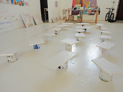
Primed Supports for New Work
New painting supports made: 17 small mdf supports cut and primed with one coat. One further coat needed..

25 November 2012
New Gouache Works
This autumn a new series of gouache works on fabriano extra white HP 300g paper are underway. In challenging previous work size of 'colour arena' has been readjusted and the component elements multiplied.


21 October 2012
Past, Present, Future: 10 years of the Regional Print Centre
A celebration of work by Regional Print Centre patrons, associates and members from the past 10 years.
 This 10th Birthday retrospective exhibition (Oriel Wrecsam, 6th October - 1st December 2012) and publication has been curated by the Regional Print Centre Coordinator Jim Creed and celebrates the artists who have contributed to the success of Centre over the past decade. It showcases the diversity, development and innovation of printmaking as a creative process whilst highlighting the traditional roots of the medium.
Screenprint Orange Level features in the exhibiton, made at RPC and toured extensively in South Australia with Le Chiele Wales/Ireland Print making exhchange (see previous post).
This 10th Birthday retrospective exhibition (Oriel Wrecsam, 6th October - 1st December 2012) and publication has been curated by the Regional Print Centre Coordinator Jim Creed and celebrates the artists who have contributed to the success of Centre over the past decade. It showcases the diversity, development and innovation of printmaking as a creative process whilst highlighting the traditional roots of the medium.
Screenprint Orange Level features in the exhibiton, made at RPC and toured extensively in South Australia with Le Chiele Wales/Ireland Print making exhchange (see previous post).

15 October 2012
Bangor University Degree Show Film
Andrew talks about the programme in a film commisioned by Pontio and made by Culture Colony. The film features four graduates from 2012 talking about their work in the Bangor Museum and Art gallery. the film is made and edited by Pete Telfer of Culture Colony.
(Film no longer available as Culture Colony is closed).
(Film no longer available as Culture Colony is closed).
23 July 2012
Interview with Eli Acheson from 'The Art Lounge', Môn FM
Here is the link to the Andrew Smith's in depth interview on his art work and his work as fine art subject leader on the expanding Lifelong Learning Fine Art programme and the recent degree show. Interview with Eli Acheson from 'The Art Lounge', Môn FM. Her show which features local artists and goes new on local art shows in broadcast every Monday evening 20.00 - 22.00 87.9 FM Digital radio.
21 May 2012
Ar Ymyl Lliw • Edge of Colour

28 April 2012
Ar Ymyl Lliw • Edge of Colour

31 March 2012

18 March 2012
Edge of Colour Gallery Statement

01 March 2012
UNEARTHED: the creative remains of a brownfield site
Distance of Colour is the work made for Unearthed that explores the creative legacy of Carpenters Road studios now park of the Olympic village. The work tracks the distance in time and physical space that my main concern of colour has travelled since the studio era to the present. Click here to visit Unearthed.


15 January 2012
P STOP - THE ODYSSEY

Subscribe to:
Posts (Atom)