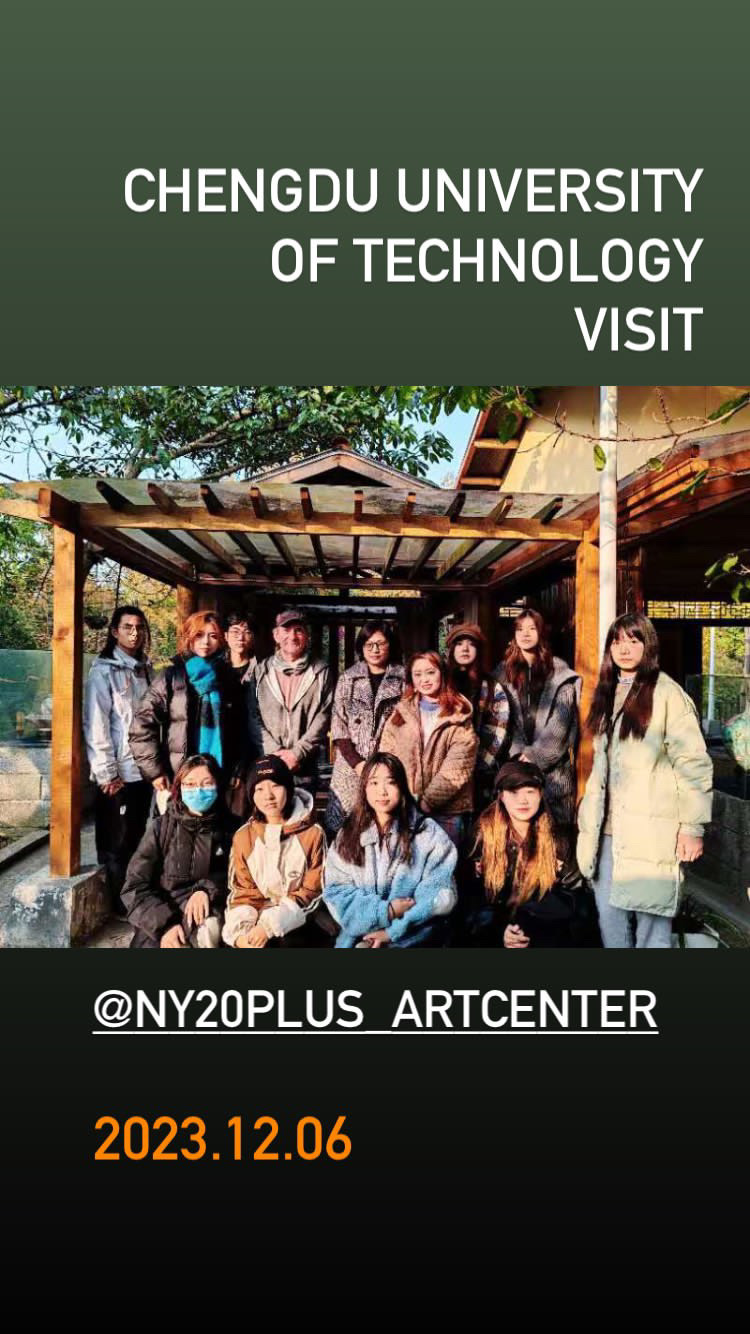
The second residency in China was at NY20+ Nongyuan International Art Village, Wuhou, Chengdu, Sichuan and proved a rich immersive cultural experience. Here I was with one, sometimes two other artists crossing over with a total of five. The experience was unique in terms of culture. Nongyuan is an art village, hotel and cultural tourist complex with artisans, gallery, and international project. I was able to take part with the organisation on many excursions to other cities and locations for artist meetings, galleries and cultural recce (see preceding post). In China, art, culture and tourism go hand in hand, culture and business are interwoven. I was also able to take part in two trade and culture fairs, a rewarding experience, where at Chengdu Creative Design Week 2024 I conducted a three day workshop with well over 100 participants of all ages.
Initial stages of new paintings started well into the residency time on the roof top studio area
At NY20+ working studio space is arranged on an ad hoc basis according to need. The porcelain studio is also available and houses an important collection of shell based porcelain applied art. I worked on the hotel roof in November with a covered room and terrace ideal for larger floor based painting until the temperature dropped early December. There is one live / work space with good floor space, loft bed space and water. Here I made three works as agreed, paintings in acrylic and with the in depth and focused experience of China manifested most in the works made here in Chengdu. The works enter the NY20+ Art Collection and were shown in the Spring Annual exhibition 2024 with one of the works incorporated into the graphics for the Dragon Boom Art Music Party launching the Spring New Year Exhibition.
Collaborative day with Yang Xuening, famous regional painter
Joint work with Luciana Schnitman (embrodiary) and Yang Xuening (paint)
Poster for Colour Exploration Workshop attended by 20 participants, art practitioners and from local community 9th December 2023
There was significant build up and preparation for this project dating back to 2021 when I first made contact with both residency organisations and I think the preceding time during the extended lockdown that China experienced compounded to create a tremendous learning experience. I wanted to experience the culture of China first hand and begin to understand the creative processes that drive the landscape tradition and calligraphic approaches in painting. The results in my own work are testament to this reflective observation and for the three works at NY20+ and the works in ink and paint on rice paper, gained a degree of critical respect from peer observation locally with state recognised practitioners with a methodology that will have lasting impact on my practice and approach.
The first stages of the residency were drawing based. Using traditional rice papers, ink and acrylic paint, I explored a calligraphic, gestural approach to drawing in parallel with observed cultural elements. This process continued throughout the residency, as during the painting production time at the end of the day, some drawings would be made, after the process of painting. Drawing then, was in response to the painting I had been looking at, a fundamental aspect of the work and development of the language in response to the placement.
Taking part in the Chengdu Creative Design Week Expo 2024 was a rich cultural learning experience. Nonyuan Culture and Art Promotion Centre had a large stand in the expo and we had two canvases for visitors to paint on. It was amazing to see how all ages were very keen to have go and use paint. Images: interviews with Chengdu TV. Pearl Yang, International Residency Coordinator NY20+ (rear)
Taking a break with fellow AiR Luciana Schnitman (Argentina)
Also Giacomo Bruno was conducting a parallel Chinese painting workshop and useful discussions and trial painting with ink took place here at the fair. I like the fluidity of ink on rice paper and the thin meandering line seems to fit with my natural desire to 'follow the brush'. Giacomo Bruni (Italy) is a well established Landscape painter, resident of China and fluent Chinese language speaker.
Giacomo Bruni (Italy) China based traditional landscape painter specialist
I requested and was given, not immediately on arrival, but some few weeks into the time at NY20+, four canvases. Two at 1.5 metre square and two at 1 metre square. As well into my time in China and after assimilation of visual art and culture, I decided almost instinctively to place the two 1 metre square canvas together to form a vertical format; this is the major characteristic of both calligraphic and landscape painting in China. On arrival, Ms Yang Li had indicated the national flower of Chengdu was the hibiscus and this might be referenced in some way. I resolved to incorporate in some way.
I wanted in this painting, to make something that referenced my perceptions of China, of what I had experienced, learnt, maybe understood and how this contrasted with ideas of the place after four years of wanting to work here in anticipation; to put something out there that encapsulated experiential thinking. Through paint, colour and application some resolution of an interpretation of the place and culture. Elements I instinctively brought in, the sun-like disc for example, I saw in the work of Liang Chi Xiong, later in Beijing (see previous post), recognising there a pictorial element already placed in my work. Vertical Chinese Landscape painting can traditionally include mountain, waterfall, trees and flower or blossom as recurring motifs. I alluded to these through abrastract elements and the overall composition is in part this with added interior. There is no compromise of the colour principle in my work here and I can cite colourists like Sue Song and Hsiao Chin. Somehow the anticipation and forward thinking is there in advance; I have found this in other instances: where one is going to, the destination, is almost present now, a kind of advance catapult for state of mind.
It is in this painting that a definite calligraphic painted form appears as distinct from the smaller brush directional painting from previous. It seemed to fit the language, so using a dark green (in appearance near black) the form is spontaneously applied in several minutes with a 4 inch liner brush. Orange in China means good fortune or good luck. Black corresponds to water and is seen as a heavenly colour.
In another section, a similar dark colour is applied but this time wet in wet worked back with a white. It gives a form and emphasis that increases space; a method to be used in future but not in every case, as the straight dark colour, flat, is also commanding. As with every colour application; colour needs colour and dynamic depends on the pictorial context.
Early stages on roof top studio and below in the main studio downstairs
I was able to take a short video on aspects of the making. Here the calligraphic section. Painting applied in one action.
Tianfu Xinzhan 天府新站 2024.01 Acrylic on Canvas 200 x 100 cm
As part of the assimilation of the culture of China, I was constantly aware of geometric design, wood traces across window and door features, in fabric design and on porcelain and ceramic. Ancient Chinese symbols permeate every aspect of applied design and in the first painting on 1.5 metre canvas there is reference to the ancient symbol for good fortune. The other works have right-angled thin lines making square and rectangle, useful pictorial devices for frame within the frame of the overall dimension.
Ancient China symbol as seen in National Museum of China Porcelain galleries and belt on a costume in the Nongyuan Art Village as part of the resident Theatre
The ancient China symbol for good fortune and luck was here incorporated into the composition for the first of the series of three; usually in series, one painting will lead and the others follow, although this, of course, can switch. Here aspects of the place was found in basic structure, snake like forms from the porcelain, geometric elements observed, these can all form part of a broad platform of organisation from which to explore colour.
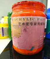
The reds seemed particularly strong here and different paints seemed to work in different ways. From my instagram post dated 24.12.28 ".. paints are good here with an industrial character. Strong coverage, good pigment weighting, vibrancy and consistent in application being very fast drying. I have been using Liquitex gloss pour, Golden pour mediums and to separate layers, Pebeo gloss varnish (china made) also as a medium - highly compatible with the paints. Paint makes include Marie's, Wendun, Chengdu Winton plus Pebeo Studio (China)"
Two early stages and below final painting
Jingchuan 泾川 2024.01 Acrylic on Canvas 150 x 150cm
Looking at many Calligraphy paintings, individual styles and characteristics become apparent. Artists specialise in the genre. Traditionally and ever since ancient times, Chinese Calligraphy painting and the writing brush have been closely associated with people's daily lives. In Shangraou, I was able to help Mr Wang's nephew with his English homework (very good !); he (like everyone) use a writing pad on the phone to move the finger about to write quick notes. It is a form of writing and essentially visual; the text is, in part to do with visual symbol and drawing a form. Therefore, inherent in the culture is a visual form of writing and communication present in the daily lives of everyone. This has cultivated an aesthetic and cultural outlook unique to Chinese and other Asian cultures. Western civilisation and modern technology have changed perceptions of daily writing: Calligraphic Painting in the 20th century is an art form; the aesthetic expressive qualities of calligraphy, that were always present throughout history, are now highlighted.
Although, working in series, paintings were resolved chronologically and this was the third. Not sure where to go with this painting in early stages, suffice to say it was intended as celebration of the Hibiscus, it remained in progress to the final stages of the residency. Flourescents had been bought with me for both residencies in China. Here all stocks of these fluorescents were used in the early stages. Golden Fluorescent Pink is particularly strong. Brushes were my own and some obtained especially for the China Tour in advance from Cornellison in London; two large flat varnish brushes and a number of very thin long ribble type sign brush that I use for a meandering and swirling line. This new set was for this tour and will be a useful new addition to my brush range.
The paints used throughout China were acrylic and good pigment quality, handling, opacity with an industrial feel; kind of practical, they will do a good job. Coverage and opacity was very good even on more transparent and semi transparent colours. The weakness was medium, there seemed to be little availability of mediums generally and as described above, I was using a varnish as medium (very good).
Following on from the previous vertical painting, the large 8 inch flat varnish brush here was bought into use as I decided to resolve this painting that needed an overall structural form with a grand calligraphic and gestural aspect to define an outcome. This time I worked back wet in wet as on the lower section of the vertical painting and here with the increased dimension of mark, a gesture within a gesture was possible, or a different complimentary brushmark alongside or within the darker first applied.
The paintings made here will lead to a new series of works back in the studio and the methodologies embarked on will have impact on future work. In part it is a recognition of what is significant and how it relates to where one is and how one is working and how this identification of practice method might and can assimilate into ones ongoing thinking. In 'reading' Calligraphic painting much of what is readable as Chinese language, the concept of 'unreadable' in the practice, I am drawn to, as this aspect is basically fundamentally visual and what one, as a non Chinese language speaker draws one to the painting method, and what actually one responds to. In the 'unreadable' paintings, line tapers and moves toward a more abstract idiom, perhaps the most profound element of expression. In conversation also it was stated that painting is about control and the power behind the mark. This is revelatory as I have always felt this, that gesture or mark is considered in all aspects of making including non brush applied painting. Western culture considers a gestural way of painting as accidental, chance-based, loose or even playful and is basically valid critical criterion of the terms Abstraction or Abstract Painting (that is not hard-edged). The Western approach to abstraction or gesture is known in China where practice is positioned with opposite method: control and the power behind the brushwork resonates; China confirms.
Wuhou ( Hibiscus Party ) 武侯( 芙蓉盛放) 2024.01 Acrylic on Canvas 150 x 150cm
Dragon Boom : Dragon Spring 2024 Music Art Party for Lunar New Year. Painting inspired design for festival graphics January 2024
China Tour Art Project Visual Diary:
Tao Hua Tan International Painting
Residency
Taohuatan, Xuancheng Anhui Province
NY20+ Chengdu Nongyuan International Art
Residency
Nongyuan Art Village, Chengdu, Sichuan
Part 1 and 2 of a China tour October 2023 to
January 2024 by Andrew Smith
Audio: This is Not A Dream - Disfreq (with
thanks)
Acknowledgement Liu Heung Shing; Mo Chiang; Wang
Dongling; Huang Yongyu, Pan Gongkai, Yang
Jiechang


.jpeg)

.jpeg)


.jpg)
.jpg)
.jpg)


 The first stages of the residency were drawing based. Using traditional rice papers, ink and acrylic paint, I explored a calligraphic, gestural approach to drawing in parallel with observed cultural elements. This process continued throughout the residency, as during the painting production time at the end of the day, some drawings would be made, after the process of painting. Drawing then, was in response to the painting I had been looking at, a fundamental aspect of the work and development of the language in response to the placement.


.JPG)


.JPG)

.jpg)


.JPG)


.JPG)

.jpg)

.jpg)
.jpg)
.jpg)
.JPG)


