Studio work 2024 saw the production of three new large paintings on canvas and a series of works on paper, the largest paper works ever undertaken. This new work followed a time of reflection after returning in January from two Artist in Residence placements in China. The new work was made starting late March (my usual time for commencing work from St David's day 1st March when the light in the studio is good) with an aim to finish by end June for exhibition in the magnificent space at Oriel Môn on Anglesey, commencing late September.
Oriel Môn is a large gallery space with walls up to 17 metres in length and over 3 metres high. My co- exhibitor John Hedley and myself had discussed exhibition configuration and with John's use of 3D space in the central areas plus installation with mirrors and plinths, it seemed to fit with my work running on the right side on entrance that has one continuous long run of wall space. Therefore large works to capitalise on the copious gallery dimension were planned. I wanted high paintings, vertical in format, new to my previous work almost exclusively landscape format. The new work ' After China ' was to be different with as a start point, the vertical format that references the Landscape and Calligraphic painting of China; a challenge and different way forward, both in the three planned canvas works and paper series.
Stretchers for the new paintings were made from recycled paintings from the shape canvas era (pre 2016) and actually three paintings that had never been completed were decided to be reconfigured. Dismantling them and making into rectangular formats was the first stage; the build outs removed and straight struts used to make new stretchers. Having decided on large format, two were very large (more than two metres in height). The paper boards were stretched with Fabriano 150g drawing paper (on a roll) using the full size of the board; this size of paper the largest yet undertaken.
Talking about new large vertical works on paper considering what is the difference between these and the new large paintings
Reworking stretchers from previous work that had build outs to create rectangular stretchers
Painting began on the canvas in response to the format of the painting; areas of fluorescent paint and medium (Golden) were applied to configure the space on each. The start time focuses the mind and develops thinking around making the painting. Here the process of applying blocks or areas of fluorescent colour (orange, yellow, green and pink), is perhaps formulaic and a gateway to kick start the engagement with the painting, its dimension, area and scale. The process starts by this method and from this point on the arena of the practice of painting is defined. What did I want with these new works? Following on from the 'final act' painting at Chengdu, the calligraphic like gestural element was to feature in all these works. I wanted to push this aspect of the language of painting and in a grand way. I wanted to encapsulate cultural and environmental aspects of China through visual forms encountered. Screens, for example (with right angled structure) that cross wall and openings; aspect of Landscape painting encountered at Guang Hui Art Museum and Chengdu Biennale and the highways, street and boulevards of the sky scraping cities encountered. Why grand? I wanted a statement in line with reflecting the size of China; its hugeness, not just physical of course but cultural, in every sense, both ancient and modern.
Early stages of Zunqiaoxing (left) and Tianfu Jincheng
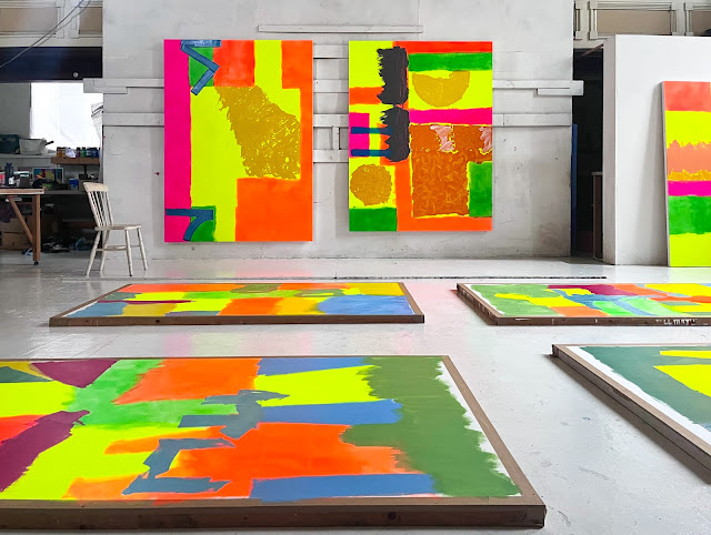
New work in progress. On the floor Shanghai series on paper and cropped right, Chongquin, started later on in the series
The Calligraphic aspect of Chinese Painting as discussed in previous two posts forms a central interest in my application of paint since 2020 and had now reached a point that a calligraphic like gestural element would be a central concern in the three new paintings and an important element of the paper based works. It seemed right conceptually that this form would be the main compositional element in the works and therefore with this in mind and clear that these elements of the paintings would be made toward the end of the painting, the orchestration and progress of the painting had this end goal in sight. This meant that as the painting progressed one was thinking that here or there would be a large scale sweeping form and that space or area was worked to support this goal. As with all my painting there is no direct planning with drawings or sketches but one is thinking ahead: this could work or that might be good.
ZUNQIAOXING
The following images are of Zunqiaoxing in stages of development. below, for example features the large yellow disc that would in the final calligraphic stage hold the large brush 'statement'.
The grid forms appearing on all three large paintings are reminiscent of my memory of the interior artichectural features across walls, windows and screens. These are applied using masking tape fior straight edge. Pictorially they command the dimension of the painting by engaging the edges of the canvas and implying continuation whilst also setting a horizontal contrast.
Echoing the main opposite direction form of the top part of the painting these two dual angle blocks in deep red maroon imply a grid but are not complete. Sitting on top of the fluid down pouring element, they emphasis the vertical aspect of the painting.
The main opposite direction form (two right angles) at the top part of the painting in progress
Reworked multiple times with varnish this higher disc form has a floating gestural paint form in a green gloss medium layer that has a spontaneous and uncontrolled application that at once defines the area and perimeter.
In taking about this part of the painting I wanted to express what the brushwork means and how it aligns with the ethos and intention of the work.
This was the first of the three large painting to have the large calligraphic like gestural element applied toward the concluding stages. In order to work directly above the painting, an improvised ladder platform was used. This was later developed with a fitted platform to rest in the centre (see later images) and is now a studio equipment for future works that require central positioning to floor based painting; so directly above the area to be painted. If from the side, a stretch or side positioning could lead to an unsatisfactory or even awkward gesture. This facility allowed full arm, hand, brush sweep, subject to paint load and viscosity of course.
Talking about the later stages of the making of Zunqiaouxing. With this part of the painting stage, reflective comment on the timing, approach and practicality of getting above the floor based work.
TIANFU JINCHENG
Tianfu Jincheng was the first of the large paintings to be worked on after initial fluorescent stages and the second to be resolved with final calligraphic like gestural element. The intensity of colour in this painting seemed to be the most developed in terms of luminosity and vibrancy. In this new series of work I wanted to further develop my use of acrylic paints and mediums. Using several Liquitex, Golden and other mediums a full range of colour application was possible. Really one is no longer talking about acrylic paint as the mediums are the most significant carriers for the colour. In most cases, small amounts of paint are used, it is like a pigment for the mediums. I am using Golden, Schminke Academy, Jo Sonjas and Liquitex paint. Following from China where my main improvised medium was a Pebeo varnish (made under licence in China) I bought a Pebeo varnish here but it did not have the same consistency of handling or function as the China version. Varnishes are used throughout my process to add a break in the layers of paint, provide support for further applications and revitalise the areas of colour. I am primarily using gloss or semi gloss varnish and medium. Jo Sonja paints I have found are very good paints made by Australian Chroma. I have always liked the range of colour, slightly unusual names and hue, but they are matte paints, so I have to work hard on them to create lustre and finish.
Created with a negative space this sun like disc seemed to work with a sliding horizon; the right orange bar one of the original fluorescent columns of colour, reworked with later additions of orange.
These square format forms are reminiscent of the signature sections on paper based work in China. I find they are useful small focus compositions within the composition and have experimented with different internal paint applications for them; internal as there is border around the edge. The change of scale and focus creates a picture within a picture. They are all spontaneous paint work. The section below is from Zunqiaoxing including a cropped calligraphic like gestural element and below, a square within a rectangle, gold on orange.
Early stage of the section that would hold the gestural element on Tianfu Jincheng. The images below document its application.
Section for the gestural element is masked and with the ladder platform, placed to face toward the top of the painting.
Initial application was a green grey. Quantity sufficient for large brush and full arm width gesture plus correct viscosity was required. An ivory white was then applied whilst the green grey was still wet to enable mixing and in brush stroke linear effect from the sweep of the brush. This fusion creates form in the brush mark. Below is the final removing of props. The painting of this element was completed in an afternoon and once done was there indelibly; irreconcilable if not right. I remember leaving the studio concerned that this had not worked; it was too much and did not fit. Upon returning next day, I realised with some elation that I was wrong and the element was great! I had got to a stage of thinking that this could be done. Spontaneous unconscious concentration!
The third painting in the series Chongquin follows this video. As a reflective comment on this new work, just prior to exhibition, the film is a contextual statement.
Main reflective studio comment on this series of work. The film references the dichotomic calligraphic and gestural painting genres of East and West cultures.
CHONGQUIN
Chongquin was the third in the series and the smallest at just 144 x 136 cm. Following from the other paintings this had the process behind it and a consolidation effect is bound to be in place. It has a fluidity evident, a fluidity of continuity of thinking and progress through the process of painting; something like confidence but more to do with a knowledge and understanding of the current engagement with painting. When working ensues day after day, week after week, the mindset and concentration are developed and at this plateau of thinking, dimensions and possibilities are heightened; a contrast to the start time.
This auqa turquoise was placed over the red and burnt siennas that had been applied, scrapped wet and re applied. As described earlier a coat of varnish created a base for the aqua to sit on creating space.
Chongquin contains three sections of calligraphic like gestural element and this seemed to fit with the composition in a vertical emphasis. The intense deep dark colours are, in my mind, astounding and a testament to the possibilities of the excellent pigments and mediums available. Again as in the image below, working back into the paint mark with another colour creates a standout form yet equally valid are the single colour forms that command their own structure through the operation of the surrounding and apparently underneath colour.
On the Calligraphic Like Gestural Element
The term gesture in terms of western painting implies an approach of free expression and accident. This is contrary to the method here and defining the calligraphic like gestural element of my painting methodology needs to be explored. It is a form of gestural painting in which the visible sweep and manner of applying pigment has been deliberately emphasised, to carry the maximum expressive idiom and at the same time recognising the importance of unplanned and spontaneous action, yet not one that attaches importance to splashes or spots of colour that had no intention behind them. As discussed in previous contextual posts, my painting resonates with one characteristic above many others in the Calligraphic painting of China, one of the power behind the mark being of highest importance, a method with meaning and control. Whilst no direct meaning in signs and symbols are present in my work and they remain unreadable, the resonation is with control and intention. I think perhaps, it has something to do with reality; an expression of an abstract half conscious world, that eludes both reason and direct observation.
The three ' After China ' paintings are featured here with the paper series before preparation and departure for exhibition at Oriel Môn.
Short video walking around the new work from 2024 ' After China ' with paper work still on stretched boards prior to preparation for exhibition at Oriel Môn.
Critical contextual thinking in developing this work can be found in the previous post but one:
Cysylltiad Lliw + Colour Connections Oriel Môn September to November 2024 Installation of the three paintings on canvas and four paper based work representing the complete portfolio for 2024 Cysylltiad Lliw + Colour Connections was a joint exhibition with John Hedley
The Shanghai Series: (left to right) Jing'an, Huangpu, Pudong, Yangling 212 x 114 cm 2024 Acrylic paint and mediums on paper
Zunqiaoxing 223 x 168 cm (left) and Chongquin 144 x 136 cm
2024
Acrylic paint and mediums on canvas
Chongquin 144 x 136 cm (left) and Tianfu Jincheng 235 x 171 cm
2024
Acrylic paint and mediums on canvas
I would like to acknowledge the support of Wales Arts International and Arts Council of Wales for the support received in developing this series of work.
%202.jpg)


.jpeg)
.jpeg)
.jpeg)
.jpg)
.jpg)


.jpg)


.jpg)


.jpg)


