Yr Afanc
For my beast, I chose Yr Afanc. The choice was partly to do with geographic location, Yr Afanc is described to have dwelt at Betws y Coed near to my my studio location in nearby Meirionnydd and also because the visual documentation of the beast is scarce, leaving more to the imagination.
The beast is described as ferocious and terrifying, being sometimes a dwarf like creature, frog with claws or like a beaver. It is quite large and big enough to cause flooding in the Conwy valley from the lake where it resided and is named after, Llyn Yr Afanc. It had green eyes and could emit loud noise. Legend says because of the flooding, the people of Betws planned to remove Yr Afanc and eventually with the help of many people, oxen, and a maiden to tempt the beast out of the lake, it was dragged up the Lledr Valley to Llyn Ffynnon Las, close to the summit of Snowdon where, hemmed in by the rocks around the lake, it is now trapped. Yr Afanc was perhaps evolved as a myth because of the flooding that is a continual issue in the Conwy valley.
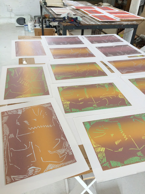
The description of demon is useful. My interpretation was to envisage a large beast, that would fill the print. It would have as a feature at least one eye, a large jaw with zig zig teeth and claws perhaps similar to a crab. However, I did not want to be descriptive rather create a form alluding to elements of this imaginary creature that might loom in and out of focus as perhaps in a dream. The looming in and out of focus is also linked by the beasts location at the lake. I imagined mists and fog the would be horizontal across the surface of the lake and this would distort the form of the beast and make its presence more foreboding; what we cannot see, we fear.
Methodology
My preferred choice for the prints was reduction linocut. The inherent drawing process fits with the subject yet allows flexibility in the cutting for non-linear areas of flat colour. The linear marks left by cut away sections would add to the expressive quality. Being familiar with reduction lino print (where one plate is reduced by repeated cut and print and the image made by successive overprinting), I felt the combined drawing and colour application could deliver satisfactory result.
Three lino blocks were started with three different Yr Afanc drawings, making three series of prints. For these, initial idea drawings in pencil were made and then the structure carried onto the block for cutting. The initial print of the block was without any cutting so solid colour (no blank paper) is evident in the final prints.
Materials used were oil paints with Daler Rowney block printing medium, printing onto Seawight 250gram acid free cartridge paper. Equipment was an Intaglio JM25 roller press with one blanket and perspex blocks to support the lino, that is flexible. The perspex blocks also reduce slippage, a common issue with lino block/roller pressing.
Colour was applied with lightest first then through successive printing moving toward deep blue black for final linear description. Colour was applied throughout in stripes with two colours on the roller to facilitate the effect of the mist running horizontally through the prints. This also highlighted the effect of hue and tone and with interaction of colours to varying degrees of contrast so that in places it is just the hue rather than any tonal element that is evident. The feature of mist or fog was as important for me as the drawing of the imagined Yr Afanc.
Reflective Comment on Process
Non figuration and abstraction are terms not unfamiliar to the labelling of my work although neither are really true. However, the challenge of the bestiary with its descriptive and literary facet was to be challenging and I found myself returning to methods previously departed from.
In actuality, the territory was surprisingly familiar though and the intervening exploratory practice largely to do with colour came into a new perspective as the process developed. My prime investigation in studio practice into colour remained to the fore by the deliberate decision to use my existing range of oil paints and mix on my painting palette with block printing medium.
With print there is necessarily time to wait and absorb as you work through the at times laborious method of making prints, but these are essential periods when reflection can take place. The linocuts appear structured and planned; this must be to do with the cutting away of the block. You have to do this section and slice through the surface, imagining what will remain underneath (the colour previously printed) but in effect through colour, the chance revelations of one colour against another happen despite all planning, revealing something new and unexpected and the element of chance and risk remains.
For me, the final cut and print remained problematic. I liked the colour of the prints but the final blue black linear elements would define Yr Afanc and further the structure of the image; it remained and printed through all three series.
Final Prints
One illustration from each series:


No comments:
Post a Comment