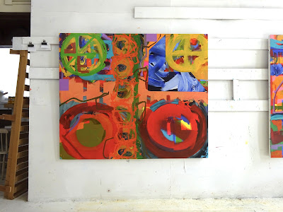
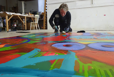
I definitely wanted quite a large circular form, as if spinning or moving (similar to that in Brink 2021, but increased in fluid dimension) and this element of the pictorial structure would facilitate the very fluid elements of paint. The trails of paint would trace and spill away from the apparently rotational form. To facilitate the circle a foam board disc was suspended for drawing purposes.
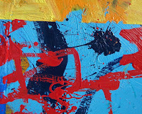
Calligraphic painting in darkest blues trace across the surface as if in a dialogue or against elements already painted, a kind of visual narrative fracturing the surface of the painting. Again as further painting is applied, parts of this illusion of narrative is emphasised or concealed, part of the compositional process in play here.
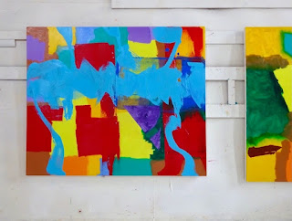
Two larger acrylic paintings were started this year, both building on the fluid paint application approach of previous works. I was aiming in these paintings to push the capabilities of paint and colour, forming a new dialogue on pictorial composition whereby less brush and more non contact application becomes a priority.
Process starts with lighter and often, but not exclusively, fluorescent areas of colour. Sometimes these are evident right through to the final stages and the contrast between early and late stages is of course part of the final resolution. In other words the time and placement of elements of each painting are part of the final experience. Not all areas are reworked and layered and those that are and are not, contrast.
The fluid application is worth commenting here as I was finding that the pouring medium (Liquitex) is not as fluid as I desired and therefore was applying small quantities of water as well, something I have always done on the paper acrylic works, as being more in tune or derivative from gouache or watercolour process. This leads to a more matt surface and a degree of sinking dull flatness. This was countered by varnish (Windsor and Newton semi gloss and gloss) applied to lift dried paint surface, that it does to a certain degree and also to provide a base support for further paint application.
The central red area, top left painting was applied early on in the painting as can be seen in the early photo and this pivotal part of the painting remained throughout to conclusion. The red was overworked with more red but I kept this area as was throughout all other layers, applications and elements of the painting.
Red Eclipse 2022/3 acrylic on canvas 160 x 183 cm


No comments:
Post a Comment